Redesigning the Build UI landing page
I'm currently working on new components for Build UI so I decided to do a redesign of the landing page to prepare for the launch. This is the evolution of the design from launching the product on September 2020 to how it stands today.
Build UI is a compilation of step-by-step tutorials, videos and code snippets to guide you on how to make pricing tables, badges, dynamic sections, and more into your new or existing Carrd projects. Click here to learn more → https://componentsui.com/build/
Launch design
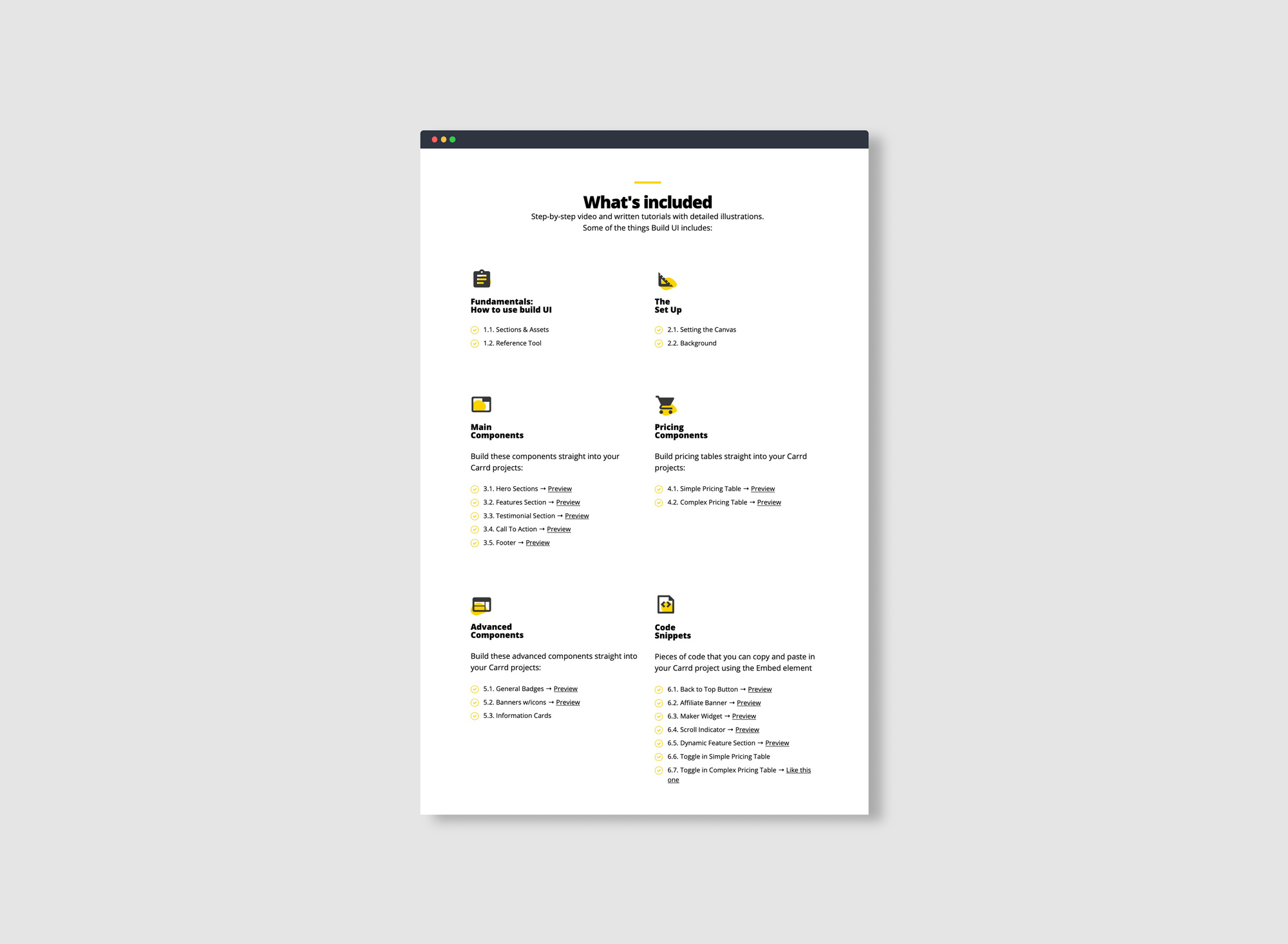
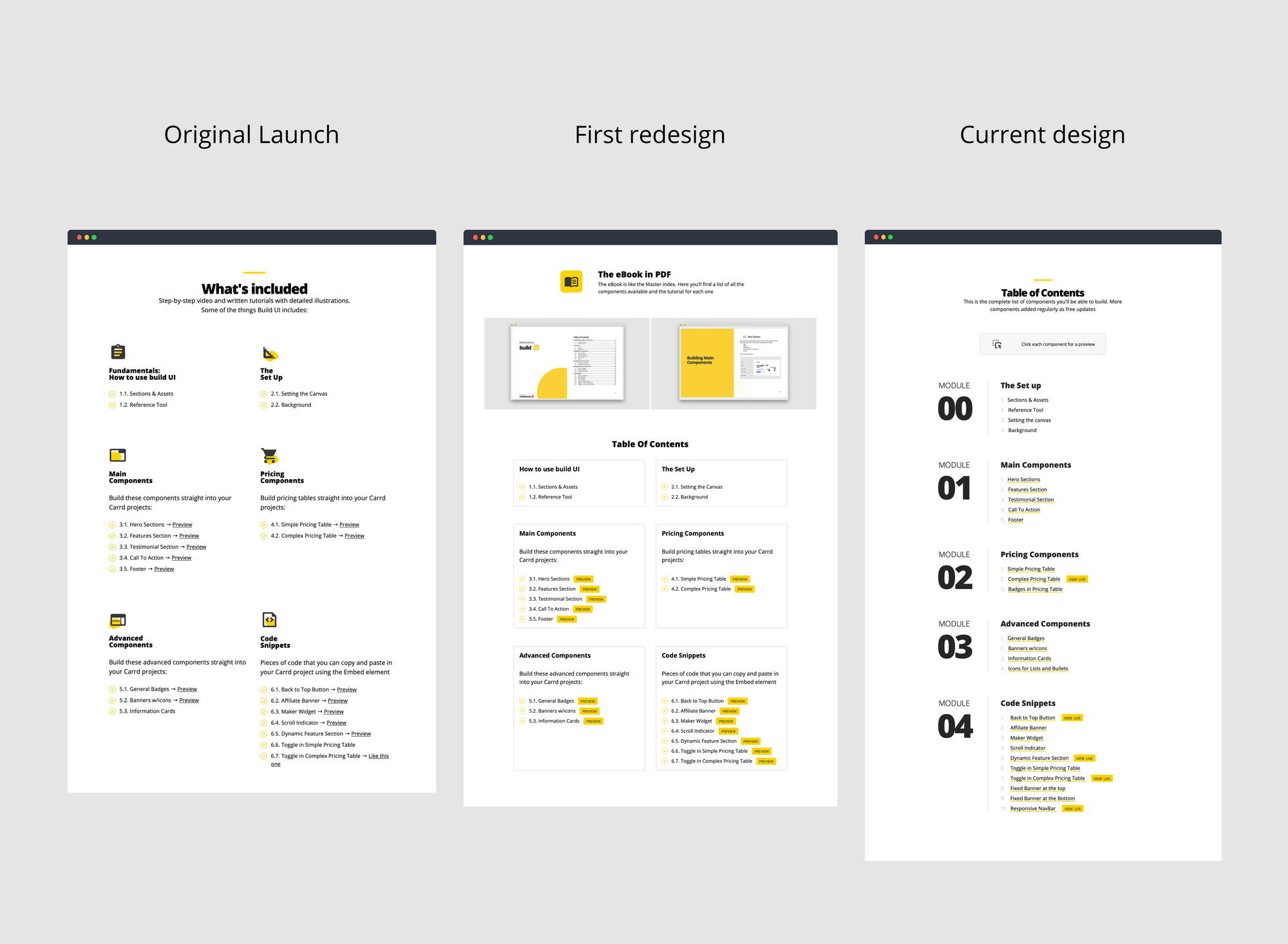
For the original launch of Build UI I decided to start with a clean list of the components available. I added some icons to make it visually appealing. No buttons. Just links with the word "preview" to check out how each component looks like.
Things I don't like about this design:
- I added bullets but then added numbers to each bullet. I should have kept either the bullet or the number
- I added the "preview" link to each component to let the visitor know that they could see a preview but it added clutter to the design. It feels like the word "preview" is everywhere and it looses meaning
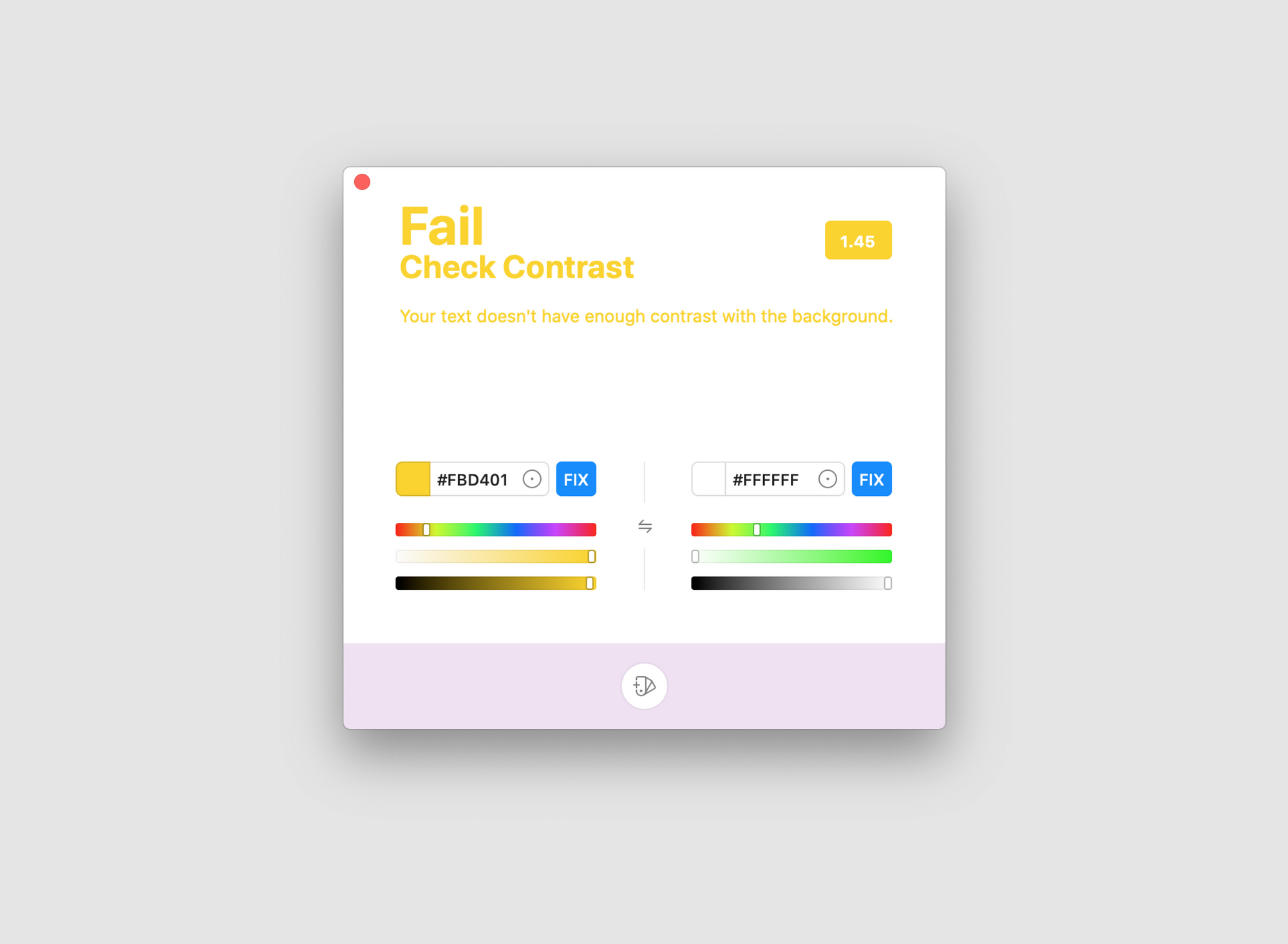
- The contrast between the bullet and the background is terrible. It fails the Web Content Accessibility Guidelines color contrast ratios
First redesign
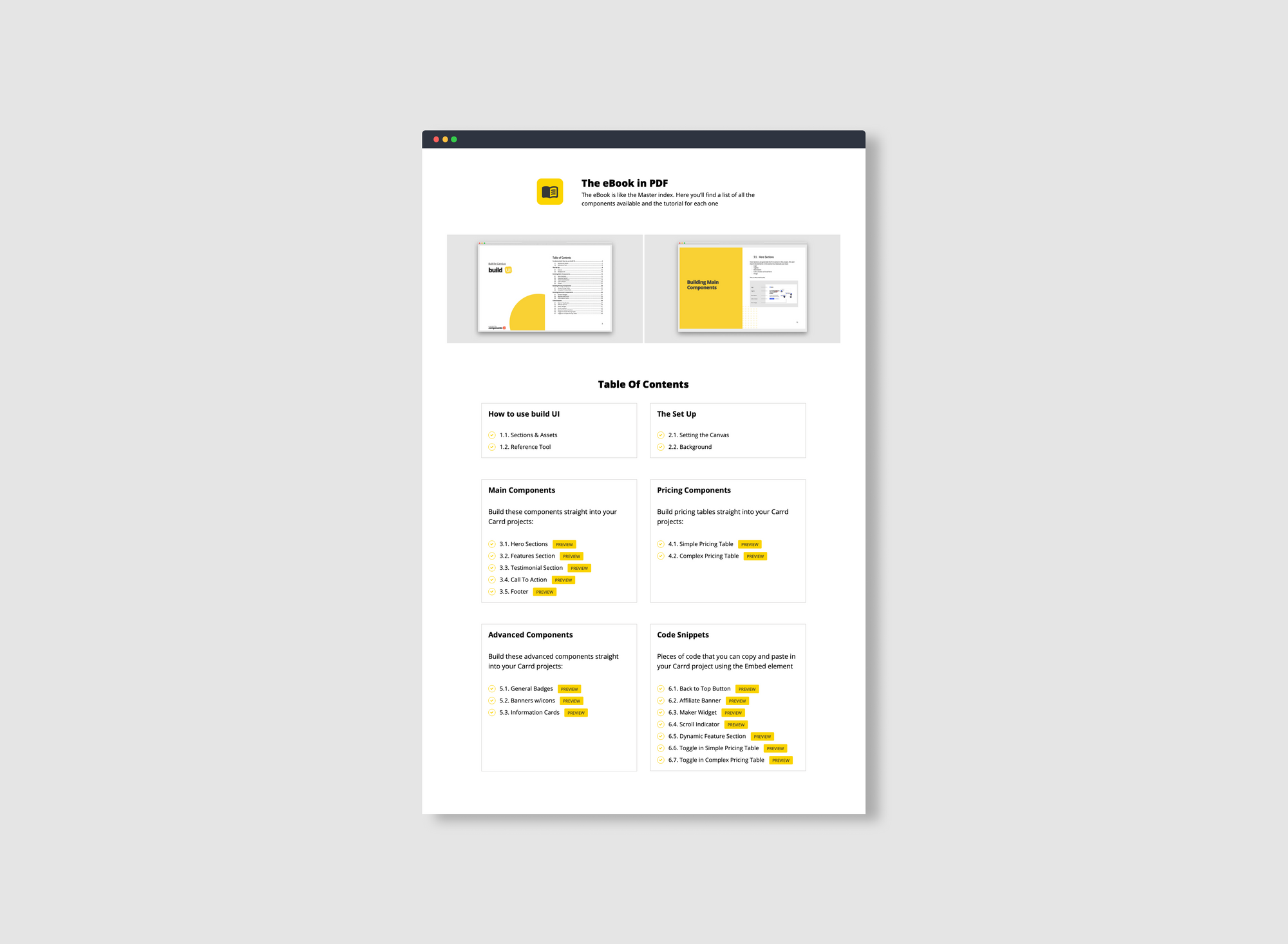
I did the first redesign on Nov, 2020. I removed the icons to clean up the design and grouped the components into boxes. I think the boxes help see where each category begins and ends. That was not the case from the previous design where it's hard to separate the categories. I added buttons for the preview instead of just a simple link.
Things I don't like about this design:
- For some reason I kept the bullets but then added numbers to each bullet. Looking back I see I was trying to show how many components each category had. Should had kept just the numbers
- There are a crap ton of buttons on the page. The design feels crowded and the button looses its meaning
- The contrast between the bullet and the background still fails
Current design
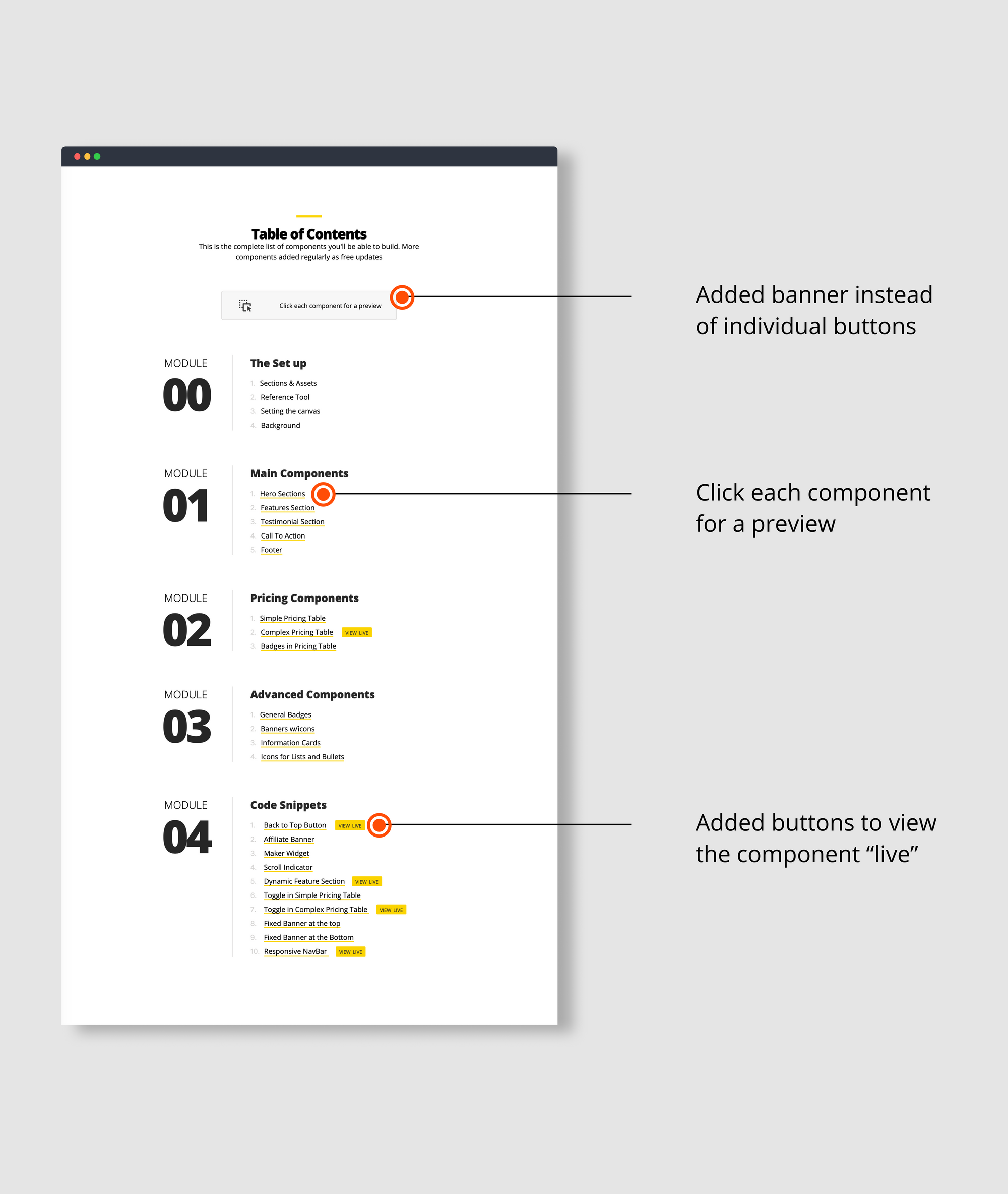
For the current design — Feb 2021 — I decided to make the modules in one single column instead of two columns. I removed the boxes but used huge numbers to easily group the categories and show where each one begins and ends. I removed the bullets (finally) and just kept the numbers for each component.
I Removed the "preview" buttons for each component and added one single banner at the top to let the visitor know that they can click each component to get a preview. Added buttons for certain components to show how they look "live" in an actual project so they can get the feel of how the component actually works.
In my mind this design looks cleaner and serves the visitor instead of the page itself. It helps show what the product is about in a simple manner without clutter. Here's how the evolution of the design looks like:
One key lesson of this process is that you won't get it right the first time. You should iterate on the process and learn from your mistakes. Keep shipping updates and working on your product as you learn. I think it's true that you should be ashamed of your first iteration, otherwise you launched it too late.
Like it? Don't like? Thoughts about it? Let me know what you think on Twitter @oscaroarevalo or send me an email to oscar@oscaroarevalo.com.