A family of products: the difference between Components UI and Build UI
Components UI started as a gallery of pre-built components that you can use on your Carrd.co projects. Since then, it has grown into a family of products that you can use individually or together to complement each other. In this post I want to explain the main difference between Components UI — the core product — and Build UI. At the end I want to briefly explain how they can work together to make an amazing website in Carrd.
TL;DR - Short version
There're two main differences between Components UI and Build UI:
Components UI – the core product – has components already built for you. Build UI has tutorials to help you build the components.
- Why is this important? If you are starting a project from scratch, Components UI will be your best choice. If you already have a project but want to add a new component (for example, a pricing table) you have to use Build UI (as of this writing, you can't "transfer" or "share" components from the Components UI gallery to another project in Carrd)
Build UI includes complex and dynamic components.
- Why is this important? You can use Build UI to add dynamic features to your webpages using code snippets (pieces of code that you can paste into Carrd as an embed element) like a Responsive Navbar for mobile devices or a toggle for your pricing tables if you offer yearly or monthly payment plans. This dynamic components are not included in Components UI.
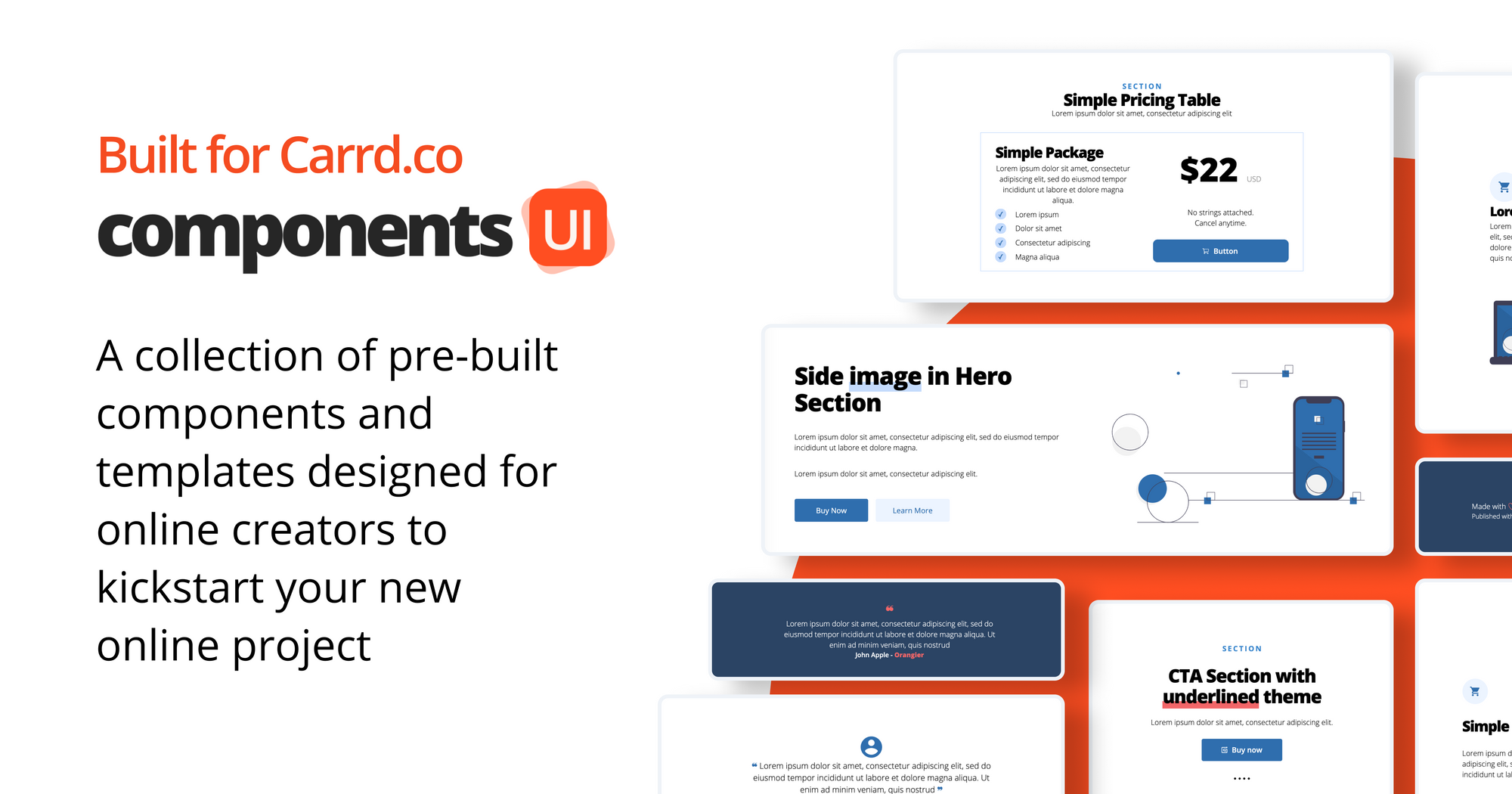
What's Components UI
Components UI is a collection of pre-built components and templates designed for Carrd.co. It comes in three packages and it includes components like complex pricing tables, badges, stats sections and more. The components are already built for you so you'll receive the gallery in your Carrd account once you purchase. After that you can start building your own website by editing the components with your own colors and images and moving the components around as you see fit.
Depending on the package you'll get:
- Components Gallery delivered to your Carrd account as a Carrd Project
- A PDF Ebook with instructions on how to use and edit the components
- Templates that you can duplicate and modify for your products or services
- Tutorial videos with visual instructions on how to use and get started with the Components UI Gallery
In brief: The Components UI packages include a gallery of components already built for you to use on your Carrd projects and delivered to you straight to your Carrd account.
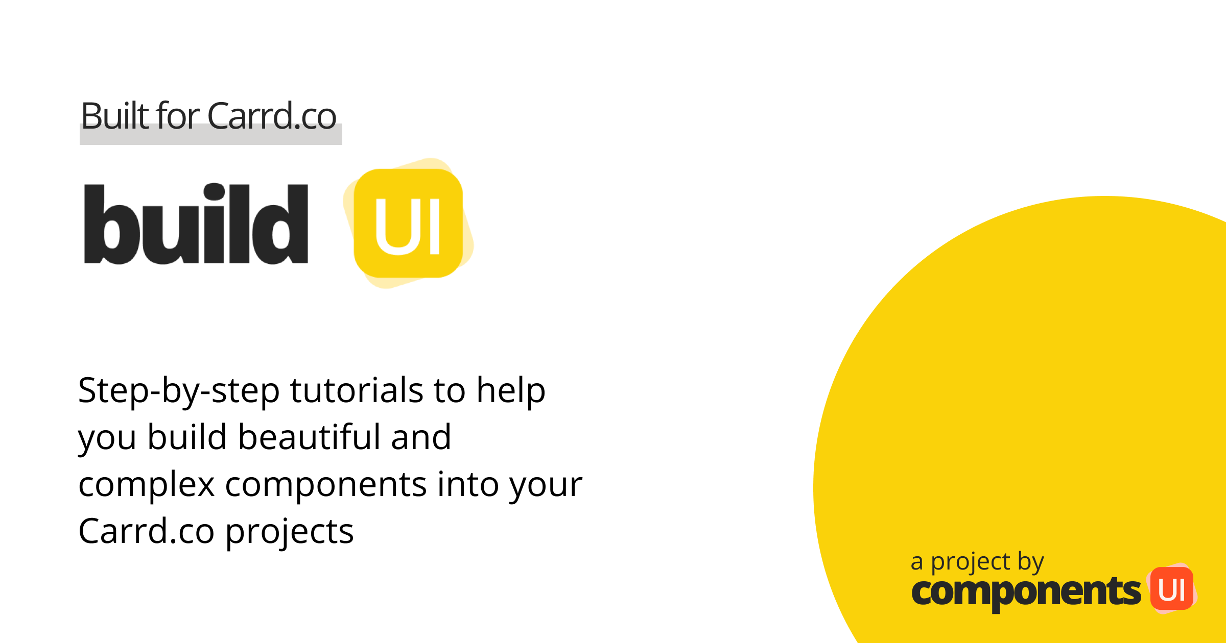
What's Build UI
Build UI is a compilation of video and written step-by-step tutorials to help you build beautiful components like complex toggles in pricing tables, responsive NavBars, dynamic sections, and more just by using Carrd elements and little pieces of code.
With Build UI you'll get video/written tutorials and pieces of code to build complex components on your Carrd projects. Most of these complex components — like a Responsive NavBar for mobile devices — are not included on the Components UI packages.
Depending on the package you'll get:
- A PDF eBook where you’ll find a list of all the components available and the tutorial for each one
- Tutorial videos on how to make the components
- Code snippets: Pieces of code that you can copy and paste in your Carrd project using the Embed element
Build UI is meant to be used as a reference tool: Decide what component(s) you want to build in your project, follow the steps in the tutorial and copy the code (if necessary) to build it. That’s it.
In brief: The Build UI packages include tutorials that show you how to make complex components on your Carrd projects. Some of these complex components use pieces of code (called "code snippets") that are not available in the Components UI packages.
How Components UI and Build UI work together
You might be wondering why would you need to purchase both Components UI and Build UI. The short answer is: In most cases you just need either Components UI or Build UI. It all depends on your project scope and your needs.
If you are new to Carrd and want to start your new project with a brand new landing page, you might want to get Components UI. The components are already built for you so you don't have to start from scratch. Just edit the colors, add your text, change the images, move the components and you are good to go.
If you need more complex components for your project you might want to get Build UI. Let's say you already have a pricing table but want to add a toggle to slide between monthly or yearly payments (this is useful when your project includes a subscription or membership that your customers can pay yearly to get a discount): Just go to the tutorial video, copy the code snippet and paste in your Carrd project using the Embed element, follow the rest of the instructions and you are good to go. Repeat this process with other complex components you need.
The beauty of both projects is when they work together to save you time and — in turn — money.
Let's say you want to start a new subscription service: to start you might want to use the Components UI gallery to build a landing page / website and add a hero section, a features section, a complex pricing table and a footer. Once that's done you might want to add some complex components from Build UI like a toggle on the complex pricing table to accept monthly or yearly payments and add a dynamic component to your features section to make it more polish.
Using both products you developed a complete and complex landing page for your new subscription service without much effort and time.
- If you are interested in purchasing Components UI you can go here: https://componentsui.com
- If you are interested in purchasing Build UI you can go here: https://componentsui.com/build/